Working with blocks
Text, images, buttons, and the other building blocks of a page.
Blocks are the building pieces of a page. Stack them, arrange them, and style them - that's the whole model.
Adding a block
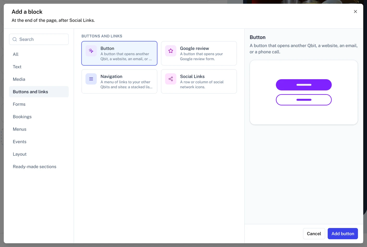
- On the Content tab, click Add a block under the list. To add between two blocks instead, hover the gap between their cards and click the + that appears.
- Pick a category on the left, or search, then click the block you want.
Text
- Heading - a heading, levels 1 through 6.
- Text - a paragraph of body copy.
- Rich text - formatted text with headings, lists, quotes, and links.
Media
- Image - an image from your media library.
- Video - a YouTube, Vimeo, or Loom video, or a link to a video file.
- PDF Viewer - display a PDF right on the page.
Buttons and links
- Button - opens another of your Qbit pages, a website, an email, or a phone call. Choose a Qbit shows each of your pages as it looks, so you pick by sight.
- Navigation - a menu of links to your other pages or websites, as a list, a row, an icon grid, a bar at the bottom of the screen, or a side menu.
- Google review - a button that opens your business's Google review form.
- Social Links - a row of icons linking to your social profiles.
Bookings
- Calendly booking - your Calendly scheduling page, so people book a time without leaving.
- OpenTable reservations - your OpenTable reservation widget, so guests reserve a table.
See Adding bookings and reservations.
Forms, Menus, and Events (Premium)
- Form - collect submissions with a form you've built.
- Menu - a restaurant menu.
- Untappd Menu - a live beer menu from Untappd for Business.
- Events and Featured Event - your upcoming events, as a list or one big feature.
Layout
- Group - holds blocks together, stacked or in a row, with a shared background.
- Spacer - vertical breathing room in four sizes (Tight, Cozy, Roomy, Spacious), with an optional line.
Ready-made sections adds a pre-built set of blocks, like a hero or a call to action, that you then edit like any other blocks.
Editing a block
Click a block's card (or the block in the phone preview) to open its panel beside the list:
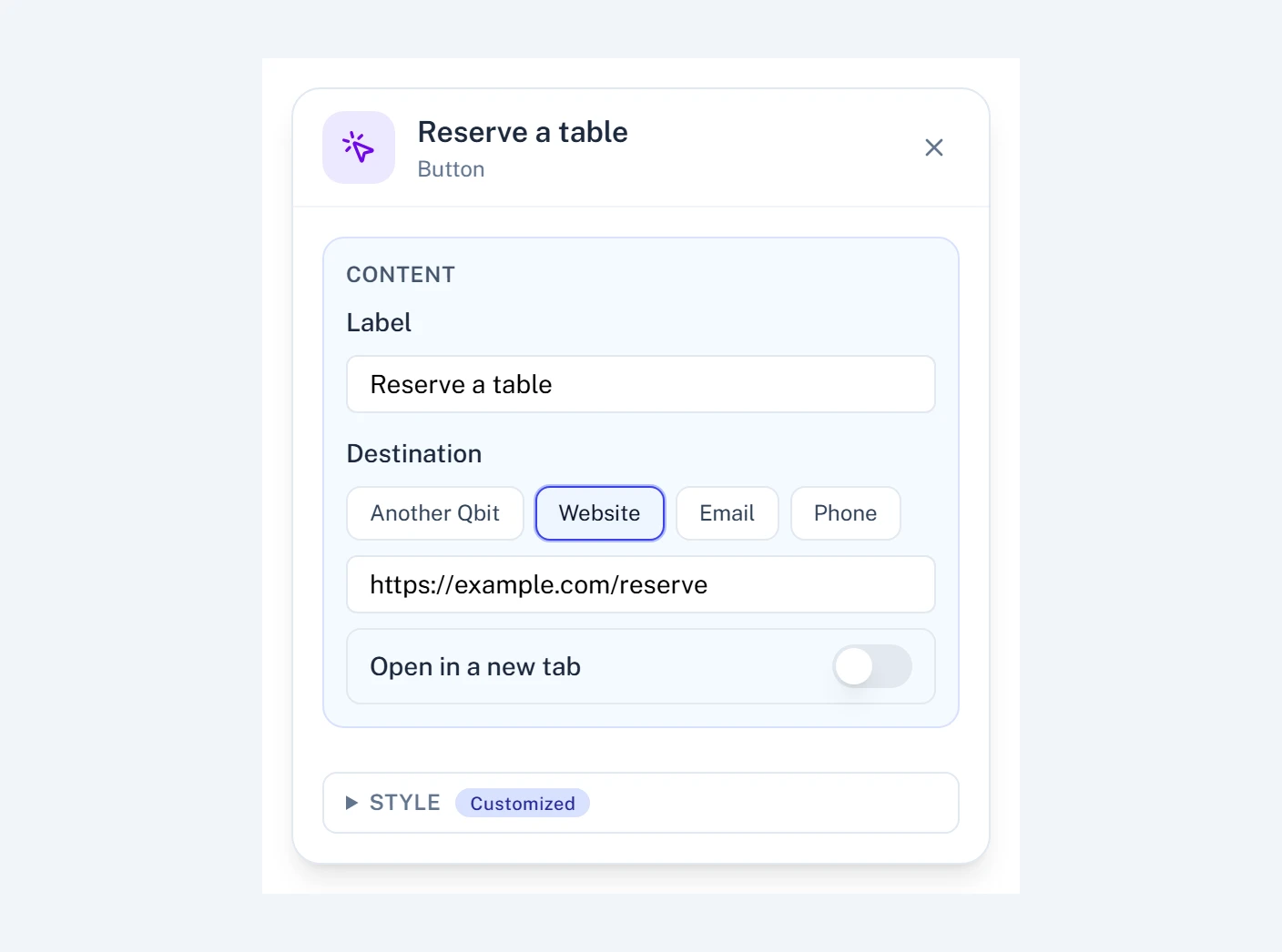
- Content - what the block says or shows: text, the image, where a button goes.
- Look - ready-made styles for the block, when it has them. Click one to try it.
- Style - fine-tune fonts, colors, and spacing. Reset custom styles clears your changes. See Styling and themes.
- Options - extra settings some blocks have, like what an Events block shows.
Sizing images
An Image block's panel sets its size right under the picture:
- Size - Small, Medium, Large, or Full width. The height follows the width, so the whole picture shows.
- Alignment - Left, Center, or Right.
Open More sizing for finer control:
- Exact width (px) - a precise width instead of a size step.
- Height - Natural keeps the picture's own shape. Square, 4:3, Wide 16:9, and Tall 3:4 crop it to that shape, and Fixed height crops it to a height you set in pixels.
- Fit - when the picture is cropped, Fill and crop fills the space and trims the edges, while Show whole image fits the entire picture inside it.
- Keep in view - which part of a cropped picture stays visible: Top, Center, Bottom, Left, or Right.
Adding a Google review button
A Google review block opens your business's review form on Google. It uses your page's button style, so it matches your other buttons.
- Add a Google review block from Buttons and links.
- Under Your business on Google, search for your business and pick it from the list. Or paste your review link: in your Google Business Profile, open Ask for reviews and copy the link.
- Click Check the review page to make sure it opens the right business.
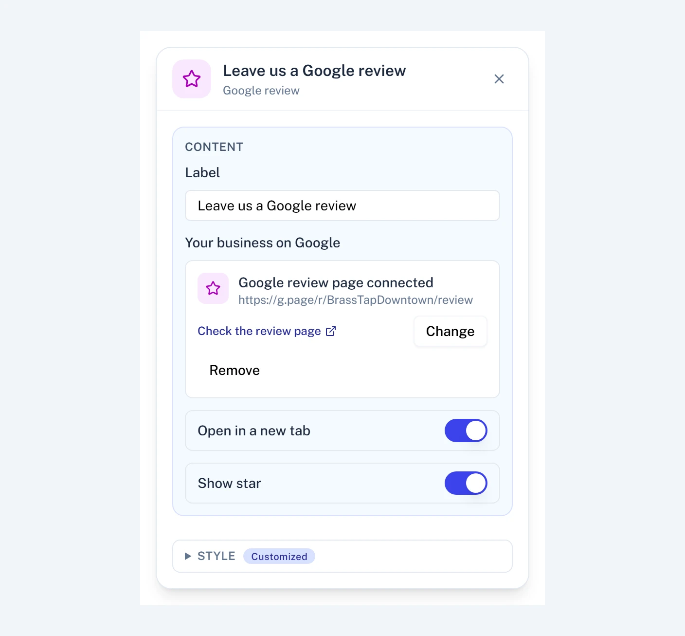
- Label - the button's text. It starts as "Leave us a Google review".
- Open in a new tab - on by default, so visitors keep your page open.
- Show star - a star before the label.
A Google Maps link doesn't work here, because it doesn't open the review form. Until you pick your business, the button shows in the editor but not on your published page.
Adding a navigation menu
A Navigation block is a set of links in one of five styles, so visitors can move between your pages.
- Add a Navigation block from Buttons and links.
- Under Style, hover a style to try it on your page and click one to apply it. Until you add links, the block shows sample links so you can compare the styles.
- Click Add link, type its Label, and set its Destination: Another Qbit, Website, Email, or Phone. Repeat for each link, up to 12.
- Publish the page.
The styles:
- Stacked list - the links as a column of buttons.
- Pill row - a row of small buttons that wraps onto new lines. Alignment sets where the row sits.
- Icon grid - tiles with an icon over each label, in 2, 3, or 4 columns.
- Bottom bar - up to five links in a bar that sticks to the bottom of the screen on the live page, with an icon over each label. The editor shows it in place, with a note.
- Side menu - a menu button that opens a panel from the edge of the screen. Panel opens from picks the left or right edge, and Menu button label and Show label beside the icon set the button's text. The editor shows the panel open; visitors tap the button to open it.
In the icon grid and the bottom bar, each link has an Icon list. Leave it on No icon for a plain label.
The links use your page's button style, so they match your other buttons. Style sets the links, the menu button, and the panel separately.
Laying out a Group
A Group's panel controls how the blocks inside it sit:
- Arrangement - Stacked or Side by side.
- Space between blocks - from None to Spacious.
- Line up - for stacked blocks, Left, Center, or Right lines up the text and pictures inside the group, and Full width stretches each block across it. Side by side, the same row lines blocks up Top, Middle, or Bottom.
- Spread across and Wrap onto new lines - for side by side blocks, how they spread out and whether they move to a new line when they don't fit.
- Background image - a picture behind everything in the group, for a hero or a banner. Click Choose image to pick one from your media library, Change image to swap it, or Remove to take it off. Applying a Look to the group keeps its picture.
Arranging and managing
Every card has the same controls:
- Drag handle - reorder by dragging, including into and out of Groups.
- Eye icon - hide a block without deleting it. Handy for seasonal content.
- Duplicate - copy the block in place.
- Delete - remove it.
A structure that works
For a typical page: an Image (logo), a Heading, a line of Text, then your Buttons, with Social Links at the bottom. Start there, then let the content earn its complexity - the best-scanning pages are short, focused, and lead with the action you want people to take.
Still stuck? Email support@qbit.codes.